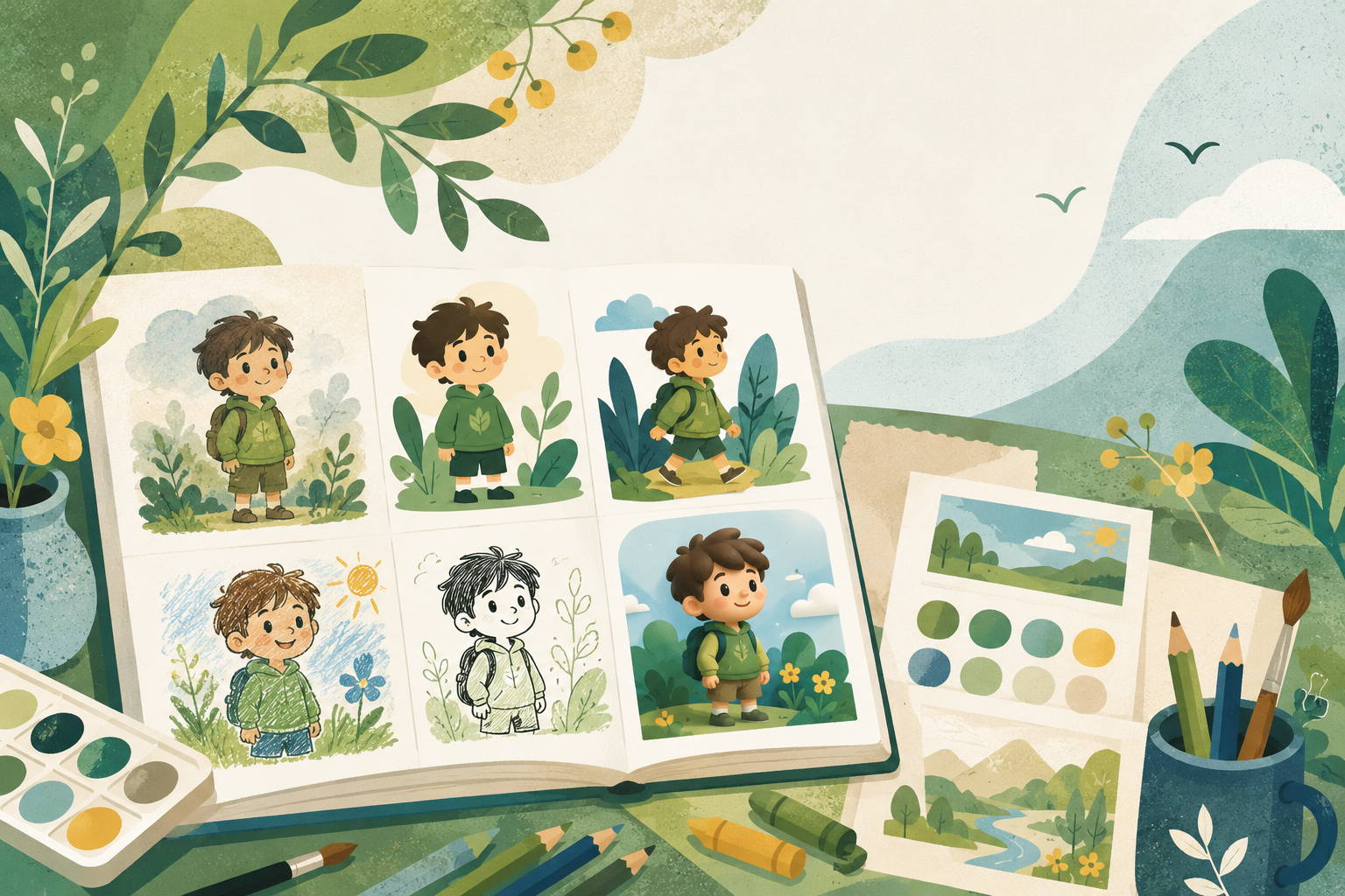
Which illustration style is right for your children's book? The short answer: the one that matches your story's age and mood, and that you're willing to hold across every single page. Style isn't decoration. It tells a reader, before they read a word, how old this book is for and how it's going to feel.
A soft watercolor whispers bedtime. A bold, flat, high-contrast look shouts playground. Get the style right and the book feels finished before you've illustrated a thing. Get it wrong and even good art reads as off.
What does an illustration style actually signal?
Two things, mostly: age and tone.
Age first. Softer, rounder, simpler art reads younger. Babies and toddlers want big shapes, few details, gentle edges. As the reader gets older, the art can carry more detail, texture, and visual jokes hiding in the background. A six-year-old will hunt the corners of a busy spread; a one-year-old just wants the duck to be clearly a duck.
Tone second. The same scene feels completely different in a hazy watercolor versus a crisp papercut versus a glossy 3D render. Before you pick, finish this sentence: "When a parent closes this book, I want them to feel ____." Cozy? Giggly? Brave? That word is your style brief.
2D or 3D for a children's book?
This is the first fork, so take it head-on.
2D styles (watercolor, flat, papercut, ink, crayon) feel handmade, warm, and timeless. They're the classic picture-book look for a reason: they leave room for imagination and they age well on a shelf.
3D styles feel modern, rounded, and playful, closer to the look of an animated film. Kids raised on animated movies often gravitate to it, and it can make characters feel huggable and toy-like.
Neither is better. Pick by feel:
- Lean 2D for quiet, lyrical, bedtime, or nostalgic stories, and for that traditional picture-book warmth.
- Lean 3D for bouncy adventure, broad comedy, or a contemporary, animated feel.
When you're torn, read your story's calmest page and your wildest page aloud, and ask which look you'd want behind each. The answer is usually obvious by the second read.
Why you should pick one style and hold it
Here's the rule beginners break most: one style, the whole book. Mixing a watercolor page with a 3D page reads as amateur instantly, the same way a font change mid-sentence does. The story should change page to page; the look should not.
Now someone's going to ask: doesn't variety keep it interesting? Variety in what happens keeps it interesting. Variety in the look just makes it feel like several different books got shuffled together. Consistency of style is what makes the whole thing feel like a real, single book.
This is exactly why Storybench gives you a range of single-select illustration styles, 2D and 3D, and lets you pick one per book. You choose the look once when you create your World, and every page holds it automatically. No drift between pages, no second-guessing the palette halfway through. You can see the range on the creators page.
A quick way to land on your style
- Name the feeling. Cozy, zany, brave, dreamy. One word.
- Name the age. Toddler, preschool, early reader. Younger means simpler.
- Pick the dimension. Handmade and timeless (2D) or animated and playful (3D)?
- Commit, then don't look back. One style for the whole book, and the sequel.
That's it. Four small decisions and the look of your book is set.
Frequently asked questions
Can I change the illustration style after I start?
You can change your mind early, but a book should land on one style and keep it. In Storybench the style is set per book, so the cleanest path is to choose deliberately up front. A new look is really a new World, which keeps every page in a single consistent style.
Is watercolor or flat better for toddlers?
Both work; what matters more for toddlers is simplicity. Big clear shapes, few details, and gentle edges read best for the youngest kids, whether that's soft watercolor or clean flat color.
Do I need art skills to choose and use a style?
No. With a book-first tool you pick a style from a set and the tool illustrates in it. Storybench requires no drawing skills: you choose one of a range of styles and write each page, and the art comes back in that style every time.
How many styles should one book use?
One. A single consistent style across every page is what makes a book feel finished and professional. Save the other looks for a different book.
Pick the feeling first, the dimension second, and let the book hold the look from there. When you're ready to choose yours , start creating. Watch it stick to every page.