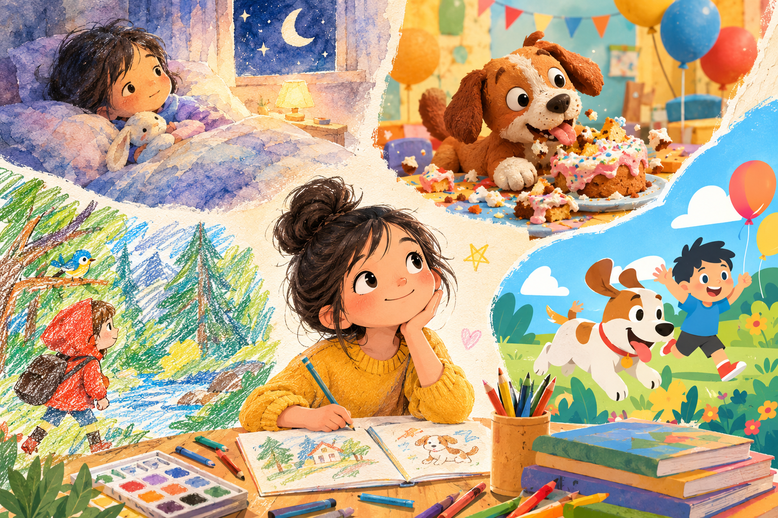
Two stories, same length, same age group. One is a hushed bedtime tale about a kid who can't sleep. The other is a chaotic romp about a dog who eats the birthday cake. Should they look the same? Of course not. The children's book art styles you reach for should carry the tone before a single word is read.
Tone is a feeling, and art is how you make a reader feel it on sight. Pick the style that matches the mood, and the book does half its emotional work for free. So instead of asking "which style is nicest," ask "which style feels like my story." Here's how the popular ones feel.
Watercolor: soft, tender, a little nostalgic
Watercolor blurs its own edges. Colors bleed gently into each other, light feels warm, and nothing has a hard line. That softness reads as calm, which is why it owns the bedtime shelf.
Reach for it when your story is quiet, lyrical, or full of feeling: a goodnight book, a story about missing someone, a gentle first-day-of-school. It makes a tender moment land. It will fight you on slapstick, though; comedy wants crisper edges.
Flat color: bright, bold, modern and friendly
Flat, graphic illustration uses clean shapes and confident blocks of color, no fussy texture. It feels upbeat, contemporary, and a touch playful. Kids read it fast because the shapes are clear.
It suits cheerful, energetic stories, counting and concept books, and anything bright and zippy. Because it's so clear, it's also kind to the youngest readers. If your story is cozy and wistful, flat can feel a little cool; that's when watercolor wins.
Papercut and collage: tactile, crafty, handmade
Papercut looks like someone built the scene out of layered paper, with little shadows where the edges lift. It feels handmade and warm, with a craft-table charm kids love.
It fits folk tales, nature stories, and anything you want to feel cozy and made-by-hand. The texture adds richness without busyness. The one watch-out: very fine, fast action can get lost in all that lovely texture.
3D and rounded render: playful, animated, huggable
A rounded 3D look feels like a frame paused from an animated film: soft volumes, bouncy characters, a glossy modern sheen. To a lot of kids, it feels instantly familiar and fun.
It's a natural fit for big adventures, broad comedy, and toy-like, lovable heroes. Think energy and motion. For a slow, hushed, old-fashioned mood, a flatter 2D style usually serves better.
How do I actually match the style to my story?
Three quick gut-checks:
- Say the mood out loud. Cozy and quiet leans watercolor or papercut. Bright and snappy leans flat. Big and bouncy leans 3D.
- Picture your saddest and silliest page. The style has to hold both. If it can carry the hardest beat in your book, it'll carry the rest.
- Trust your first reaction. The look that made you smile when you imagined your story is usually the right one. Overthinking flattens it.
And then, the part beginners forget: whatever you pick, keep it for the whole book. A tone established on page one shouldn't be undercut by a different look on page nine. One style, start to finish, is what makes the mood stick.
This is where a book-first tool helps. Storybench gives you a range of single-select styles across 2D and 3D, and you choose one per book so the tone you set holds on every page. You're not re-deciding the look mid-story or watching it drift. Want to see how the look stays put? Here's how it works, and what it's built for.
Frequently asked questions
What art style is best for a bedtime story?
Soft, low-contrast styles like watercolor read as calm and suit bedtime well. The goal is a gentle, settling feeling, so anything with soft edges and a warm, muted palette tends to work better than bright, high-energy art.
Can one art style work for a funny story and a sad one?
A good style stretches across moods within one book, which is the test: pick a look that can hold both your funniest and your most tender page. What you should not do is switch styles between those pages; that breaks the book.
Does the art style change with the reader's age?
Tone drives the style more than age does, but younger readers want simpler, clearer art whatever the tone. Pick the mood first, then simplify the execution for very young kids.
How do I keep the tone consistent across every page?
Choose one style and hold it for the whole book. In Storybench the style is set per book, so once you pick the look that matches your tone, every page inherits it automatically.
Find the feeling, find the look that feels like it, and let the whole book wear it. When you're ready to set your story's tone and watch every page keep it, start with Storybench.